![]()
![]()
![]()
![]()
![]()
![]()
![]()
Simple Principles of DesignWhile a Communications Manager should rely on the design skills of expert designers as much as possible, there will be occasions when a job is too small or too urgent to use outside experts. When this occurs, it is useful to have a set of rules to follow: · Every document should have the name and logo of the Academy on it. If it is for outside use, it should include the address, phone number, website and email contact, too. · Fonts, or typefaces, DO matter. Click here for a comprehensive design article on fonts. · Know the medium. A wall banner needs different information to an internal pop-up banner. An instruction leaflet is organised differently to a publicity leaflet. · Learn how to use Word effectively. How do you set margins? How do you produce a booklet? How do you produce a gatefold leaflet? What is the difference between an in-line picture and a floating picture? How do you insert sideways writing? FIND OUT! Click here for the current Microsoft online training. ·
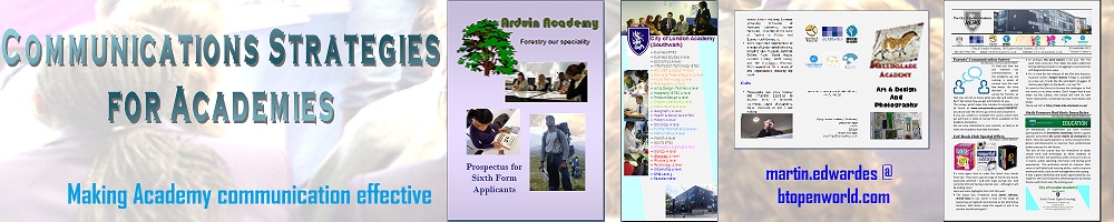
Keep formatting revealed (the · If you have design skills at your Academy (a willing Art department, a skilled reprographics technician), use them. But remember that they may not be able to meet your urgent timetables. · Be sufficient: don’t be taciturn, don’t be verbose. Make sure that all the vital information is included, but don’t include unnecessary background details. Design is a simple thing that anyone can do. Good design, however, requires thought and experience. Simple Principles of PowerPoint DesignPresentations have become vital tools for talking to audiences of all types. There are many tools available on the Internet (e.g.Canva, Prezi, PrezentiaFX, Prezentit, Slidesix), but Microsoft’s PowerPoint remains the tool of choice for many. It is worthwhile, therefore remembering a few simple rules to make PowerPoints more effective: · Don’t fill the slide with words - especially if you are saying the words at the same time as showing the slide. The slide should present the spoken information in a new way. A good rule of thumb is no more than 40 words per slide. · Avoid the PowerPoint “exciting” entrances and exits. They have their place in speakerless looped presentations, but they interfere with the flow in speaker presentations. · Avoid loading bullet points by click. They are another thing for you to remember, and constant clicking can interfere with the flow of your talk. · Have a final slide which can remain on the screen during questions. The Academy logo is usually sufficient. · Use a background. If you don’t have a standard slide background for your Academy, use one which is attractive but not intrusive. Some Prospectus Design and Form-making IdeasSome ideas for novel prospectuses and some notes on form design are in: |
Good design is obvious. Great
design is transparent.
Joe Sparano
Content precedes design. Design
in the absence of content is not design, it’s
decoration.
Jeffrey Zeldman
The dumbest mistake is viewing
design as something you do at the end of the process to ‘tidy up’ the mess,
as opposed to understanding it’s a ‘day one’ issue
and part of everything.
Tom Peters
Good design is good business.
Thomas J Watson Jr
|